
To the untrained observer, stock prices appear a circus of chaos. Randomness reigns, and discerning direction appears a fool’s errand. At first, forecasting prices seems like you’re trying to guess the next step of a drunk stumbling through an alleyway. The feat looks impossible, maddening even. The path of the intoxicated is topsy turvy, full of disorder. Many rookies view the stock market similarly. It’s a point of view born of ignorance, nurtured by conventional wisdom and Wall Street, and, ultimately, killed by education.
One of my favorite TV shows of the past decade is Lie to Me. It’s a crime drama following Dr. Cal Lightman, who is a quirky savant reminiscent of Sherlock Holmes. Cal is a body language expert who assists law enforcement in their investigations. And he’s good at his craft. Really good. He’s able to discover the truth by interpreting micro-expressions and using applied psychology. Nonverbal cues that appear random or insignificant to the layman provide the exact information Dr. Lightman needs to unmask the crook. He can spot signals hiding in the noise.
Learning about technical analysis, or what we could call the “art of charting,” offers the potential to pull your comprehension closer to Dr. Lightman. At least in the context of the stock market. Stock prices are like people. Their behavior provides clues if you know what to look for.
This month’s newsletter will help lay the groundwork. We’ll explore the bedrock principles which undergird technical analysis, and then we’ll move into how to break down a price chart from A to Z.
3 Pillars of Technical Analysis

The power of the price chart, the wisdom behind technical analysis is all based on the following pillars.
- Price Discounts Everything
- Price Trends
- History Repeats Itself
Long-time readers of our monthly newsletters might recall we first introduced these pillars in our October 2017 message, titled “The Four Core Trading Principles.” Since we provided an expansive overview in that newsletter, we will keep today’s comments brief. As an aside, since we’ll be using term technical analysis dozens of times, we’re going to abbreviate it to “TA.”
Price Discounts Everything
Countless variables impact a stock’s price. Here are just a few: the economy, politics, management issues, personnel changes, shifting consumer preferences, corporate profits, interest rates, natural disasters, wars, and pandemics. Keeping up with it all is overwhelming, and fortunately, unnecessary. TA purists believe that a stock’s price already reflects all that. The price chart, then, is a one-stop-shop for comprehensive analysis. Many chart lovers ignore everything else.
Price Trends
This principle is a play on Newton’s first law of motion, otherwise known as the law of inertia. It states that an object in motion stays in motion. Stock prices exhibiting trending characteristics. And, once a trend begins, it tends to continue. Thus, we say that a trend in motion stays in motion. Chart followers identify and trade in the direction of the primary trend. All sorts of popular phrases have arisen to reinforce the idea, like “the trend is your friend,” “don’t fight the trend,” and “trends with benefits.”
History Repeats Itself
Landscapes change. Technology advances. Economies rise and fall. Fortunes are gained and lost. Throughout it all, however, there is one unchanging element, one piece that remains on the gameboard while all others are removed and replaced. It’s humans. You and me. Our ancestors and, eventually, our posterity. We’re the creatures that ultimately drive asset prices up and down. And, it turns out, we’re all very similar – ever driven by the twin overlords of Fear and Greed. Because our collective actions are manifest on price charts, and because we keep making the same decisions, there is a repetitive nature to how prices behave. The same patterns crop up again and again. Here are two quotes that encapsulate the idea nicely. The first is from a famous trader named Jesse Livermore. The second was Winston Churchill.
“There is nothing new on Wall Street. What has happened in the past will happen again and again and again. This is because human nature does not change, and it is human emotion that always gets in the way of human intelligence. Of this I am sure. And because humans are driven by the twin overlords of fear and greed, their actions.”
“There is nothing new in the world, only the history you do not know.”
Some of you will be willing to accept the truth behind these principles on the first pass. Others might be a bit more skeptical. For the latter group, suspend your disbelief. As you start trading and see how assets behave, the validity of each piece – that prices discount everything, prices trend, and history repeats – will be made manifest.
The Hierarchy of Charting

Homo sapiens, especially those with a penchant for speculation, are curious creatures. They can’t help but tinker. In the early age of TA, simplicity ruled. Those first pioneers meticulously plotted prices by hand on paper. It was an uncomplicated art that directed one and all to focus on critical metrics like the trend, support, and resistance. There weren’t any distractions in the form of indicators to muddy the waters because they hadn’t been invented yet. It was all about listening to the message of the market, the subtle shifts in tone.
But as the explorers aged and newcomers arrived, the urge to tinker took root. Volume was probably the first indicator created. But it quickly had brothers and sisters to compete with. It’s since gotten entirely out of hand, and there are now thousands of indicators clamoring for your attention. Most charting platforms come equipped with them by default. And if you’re not careful, they can drown out the clues and signals that truly matter.
To aid you in your chart reading quest, here is a hierarchy you can follow. Consider it a pecking order that helps you move chronologically through a price chart. These items are listed in importance, from most to least. When there are conflicting signals, the variable that comes first will trump. For example, if the first item I look at is bullish and the fourth is bearish, then the first trumps. The best trading opportunities arise when all items are in alignment. If there are a lot of mixed signals, then it probably means you should toss the ticker symbol aside and find something else.
Here’s the hierarchy:
- Price Trend & Momentum
- Support & Resistance
- Moving Averages
- Volume
- Candlesticks
- Any other Indicator
The remainder of our newsletter will provide a brief introduction to each. Upon completion, you should have a great idea of how to start analyzing the chart of any asset you want. Because we’re in the data visualization business, we’ll provide many charts along the way. Let’s begin.
Trend Rida
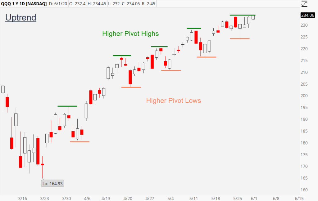
The relationship between pivots defines a stock’s trend. If the pivot highs and lows are rising, then the trend is up. This is intuitive. If you were to draw a line connecting the pivots, then it would be ascending. During an uptrend, the consensus for the value of a stock is rising. Buyers are stepping up quicker on each dip to purchase. Demand, in other words, is growing. This is bullish and reflects the improving sentiment surrounding the asset.
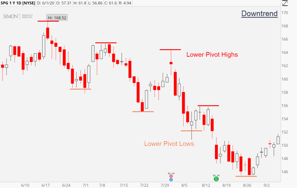
A downtrend possesses the opposite characteristics. It forms when the pivot highs and lows are falling. Connecting the pivots creates a descending line (known as a trend line), that confirms the direction of the trend. During a downtrend, the consensus for the value of a stock is falling. Sellers are increasing in aggression, and selling each rally quicker than the previous. Supply is rising and reflects the deteriorating sentiment surrounding the asset.
The primary objective of a chart reader is to spot trends, climb on board to capitalize and ride them to the end.
Momentum – Speed
If the trend measures the direction of movement, then momentum measures the speed. Think of a moving train. The trend tells us if its heading north or south. Momentum tells us if the locomotive is speeding up or slowing down. The best trends to trade with are those that are gaining steam. We can organize all trends into three momentum categories – increasing, maintaining, decreasing.
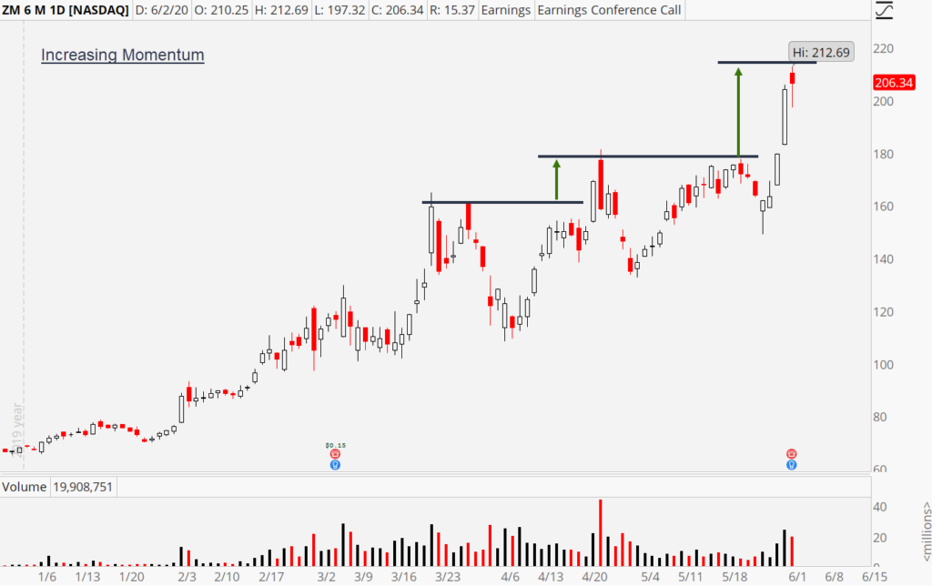
Momentum can be expressed and measured by the distance between pivots. In an uptrend, we look at pivot highs, and in a downtrend, we look at pivot lows. While there are dozens of pivots on every chart, it is the last three that we’re most concerned about. If the distance between them is increasing, then momentum is increasing. If the distance is shrinking, then momentum is slowing.
Here’s an example of an uptrend that is increasing in momentum.
And, here’s one that’s suffering slowing momentum.
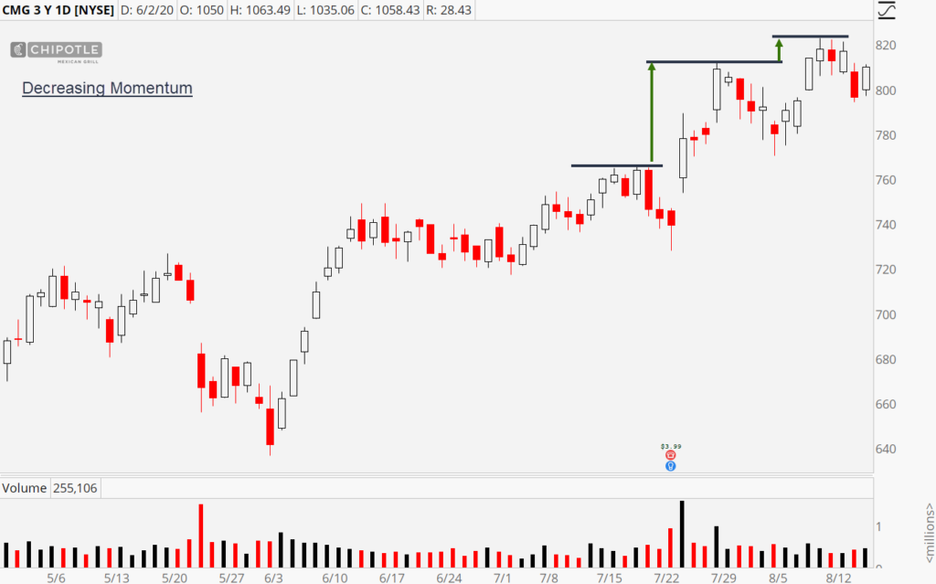
All else being equal, we’d rather buy the first uptrend. The same principle applies to measure the speed of a downtrend; only we’re looking at the pivot lows.
After the chartist identifies the trend and momentum, he’ll turn an eye toward finding the next relevant support and resistance zones.
S&R – Floors and Ceilings
As the name suggests, support is like a floor. It’s an area where demand exceeds supply and is revealed by an upward move in price. Imagine a stock moves from $5 to $4, then $4 to $3, and finally $3 to $2. There is no support in that chart because there was never an upward move in price. In contrast, let’s say a stock moves from $5 to $4 and $4 to $3. But then, the price rises back up to $4. The lift from $3 to $4 confirms support sits at $3! To summarize:
5,4,3,2 = No Support
5,4,3,4 = Support is at 3.
Since prices have memory, all old support zones have the potential to provide support in the future. In searching for the next floors, focus on prior pivots, areas of congestion, and unfilled gaps. Here’s an example with all potential support zones labeled.
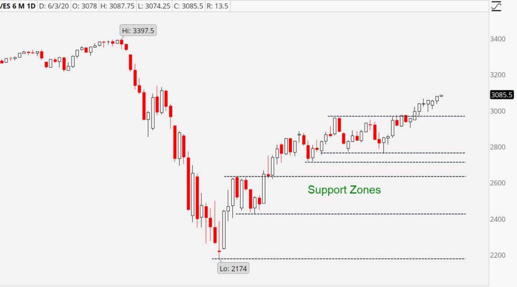
Now, we can use the same explanation flow but modify the verbiage to apply to resistance:
Resistance is like a ceiling. It’s an area where supply exceeds demand and is revealed by a downward move in price. Imagine a stock moves from $1 to $2, then $2 to $3, and finally, from $3 to 4. There is no resistance in that chart because there was never a downward move in price. In contrast, let’s say a stock move from $1 to $2, and $2 to $3. But then, the price falls back down to $2. The drop from $3 to $2 confirms resistance sits at $3. To summarize:
1,2,3,4 = No Resistance
1,2,3,2 = Resistance is at 3.
Like support, when searching for the next ceiling, focus on prior pivots, areas of congestion, and unfilled gaps. Here’s a chart with all potential resistance zones labeled.
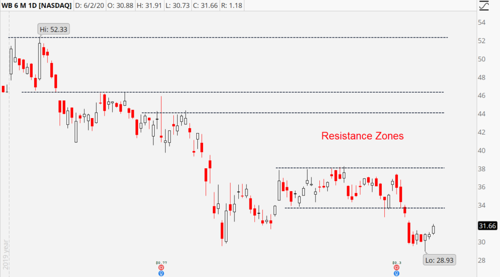
As traders, we’re trying to stack the odds in our favor when buying and selling. The baseline odds for a stock rising or falling are 50/50. In other words, you can buy any stock at any time and have about a 50% chance of success. But that’s not attractive. We want to buy when the odds favor the stock climbing, and sell when the probabilities suggest the stock will fall. That’s where support and resistance come in.
We believe stocks at support have a better chance at rising than falling. On the flip side, stocks at resistance have a better chance of falling than rising.
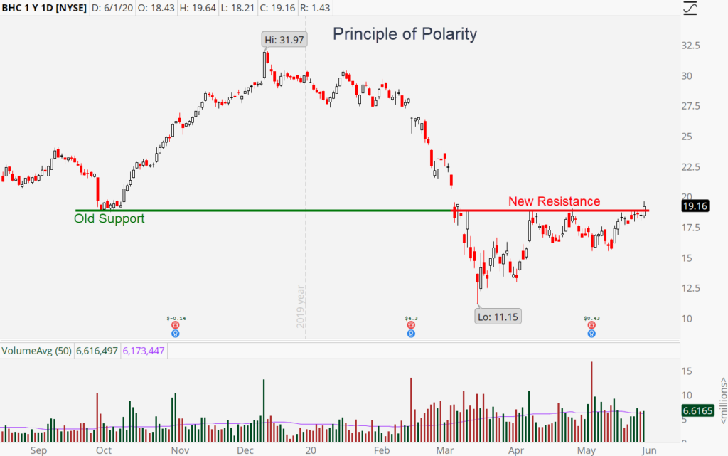
One final phenomenon you’ll hear traders discuss is known as the principle of polarity. It says that old support becomes new resistance and vice versa. It’s similar to a multi-story house. The ceiling of the first level of your home becomes the floor of the second level. And the floor of your first level becomes the ceiling of your basement.
Here’s an example of the principle:
Moving Averages – Keepin’ it Smooth
Moving averages go hand-in-hand with trend analysis. Their simple nature makes them easy to understand and use. Sometimes the relationship between pivots is hard to discern on the chart. Prices can move erratically, and there isn’t always a consistent relationship from one peak to another. Moving averages capture the essence of a trend, and plot it as a simple line. If the line is rising, the trend is up. If the line is falling, the trend is down.
There are dozens of ways to construct a moving average, but all traders should start (and potentially end) with what’s known as a simple moving average. They are constructed by adding up the closing price of each candle and dividing by the number of candles in the calculation. For example, a 20-day simple moving average is built by adding up the closing price for the past twenty sessions and dividing by 20.
Different traders use different time frames, but three of the most popular are 20-days, 50-days, and 200-days. Shorter-term moving averages are noisier but provide quicker signals that a trend is rising or falling. Long-term moving averages are slower, but provide more significant signs of the trend.
By using multiple moving averages, you can get the best of both worlds.
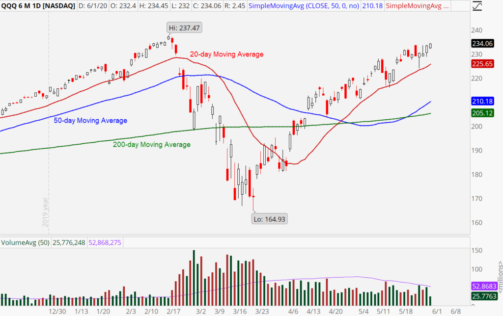
The strongest uptrends will have a price that is rising above all three moving averages. And the weakest ones will have a price falling beneath all three. In addition to helping clarify trend direction, these smoothing mechanisms also serve as gathering grounds for buyers and sellers. It’s common to see an uptrend find support at its rising 20-day moving average or a downtrend to find resistance at its descending 20-day moving average. The same goes for the 50-day and 200-day readings.
Volume Provides Punctuation
Volume measures how many shares changed hands during the session. Think of it as a measure of participation. If price is the sentence, then volume is the punctuation. In grammar, punctuation adds emphasis. Mundane, ordinary sentences end with a period. Exciting, powerful, or urgent sentences end with an exclamation point. Consider average volume a period, and high volume an exclamation point.
Most days in the market end with a period. The volume is average or low. Ordinary. It doesn’t mean much. But occasionally, an exclamation point arrives. The volume is above average or high. That’s when you want to perk up. Take note. Whatever happened that day deserves more urgency. It carries more weight than days where the volume was average.
Part of the reason why high volume days are significant is that they reveal that big players are moving money in or out. There are two types of investors: retail and institutions. Retail traders are individuals like you and me and are the insects of the jungle. Institutions are the elephants of the forest and include banks, hedge funds, mutual funds, endowment funds, and pension funds. They are the stewards of billions and even trillions of dollars in pooled money.
High volume up days are known as accumulation days because they indicate the big boys are buying or accumulating shares. This is a bullish sign. High volume down days are known as distribution days and indicate institutions are selling or distributing shares. It’s a bearish sign.
Here’s a graphic pointing out the exclamation points accompanying the price action.
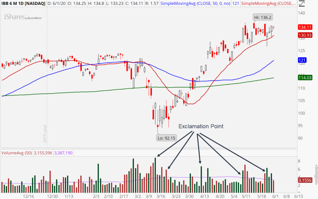
Traders like to see volume confirming the trend. In uptrends, we prefer high volume on up days and low to average volume on down days. The same goes for downtrends, except we prefer high volume on down days and low or average volume on up days.
A final usage of volume is for breakout confirmation. When a stock breaks through support or resistance zones, traders look for high volume to accompany the break. It adds validity to the breach and makes it more likely we see follow through.
In illustration 6 above, you’ll notice that a few of the exclamation points occurred when the stock’s price was blasting through resistance. That’s the type of confirmation that would encourage buyers to trust the breakout.
Candlesticks Light the Way
The final piece of the hierarchy involves looking at what types of candlestick patterns formed over the past few sessions. Were they signaling a continuation of the existing swing or signs of a reversal? There are dozens of candlestick patterns, each with their respective definitions and names. Entire books have been written about these formations, and you could spend days memorizing them. Candlestick charts are our preferred format for analyzing asset prices. They’re better than line charts, bar charts, and just about any other variation.
All Other Indicators
For many traders, candlestick analysis is the last step in the hierarchy. At that point, they’ve analyzed the chart from enough angles to decide if there’s a trade. Looking at additional information is unlikely to change their minds, so why bother?
That said, some traders do consult additional indicators. There are hundreds to choose from, each with their twist. The stochastics, MACD, RSI, and On Balance Volume are a few of the more popular ones you can dabble with if desired.
To help tie the entire hierarchy together, let’s finish with a pair of case studies.
Case Study #1: Spotify Technology (SPOT)
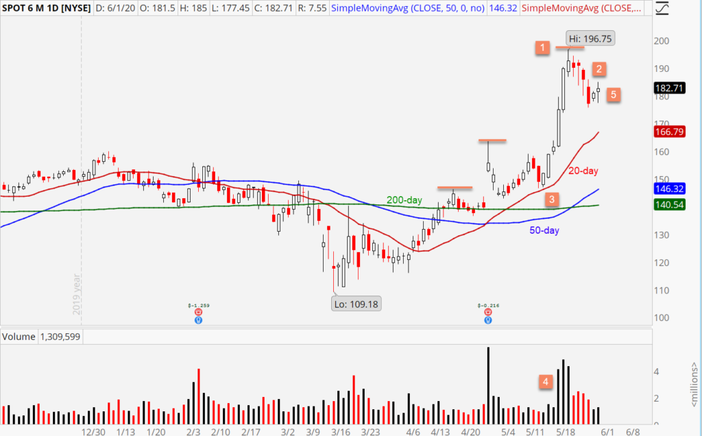
1. SPOT boasts an uptrend that increased in momentum during the last upswing.
2. After finding resistance at $196.75, SPOT pulled back four bars until finding support near $176.
3. SPOT sits above rising 20-day and 50-day moving averages. The 200-day moving average has yet to start climbing due to the recency of the breakout.
4. Heavy volume accompanied the breakout over $160, suggesting institutions were piling in. What’s more, volume during the pullback was only average, suggesting garden-variety profit-taking.
5. After flashing a bullish harami reversal candle, SPOT scored a second up day to confirm some support has been found, and the next advance might have kicked off.
Together, these five pieces of evidence point toward a classic Bull Retracement chart pattern. Bulls might look to buy the stock here.
Case Study #2: Weibo Corporation (WB)
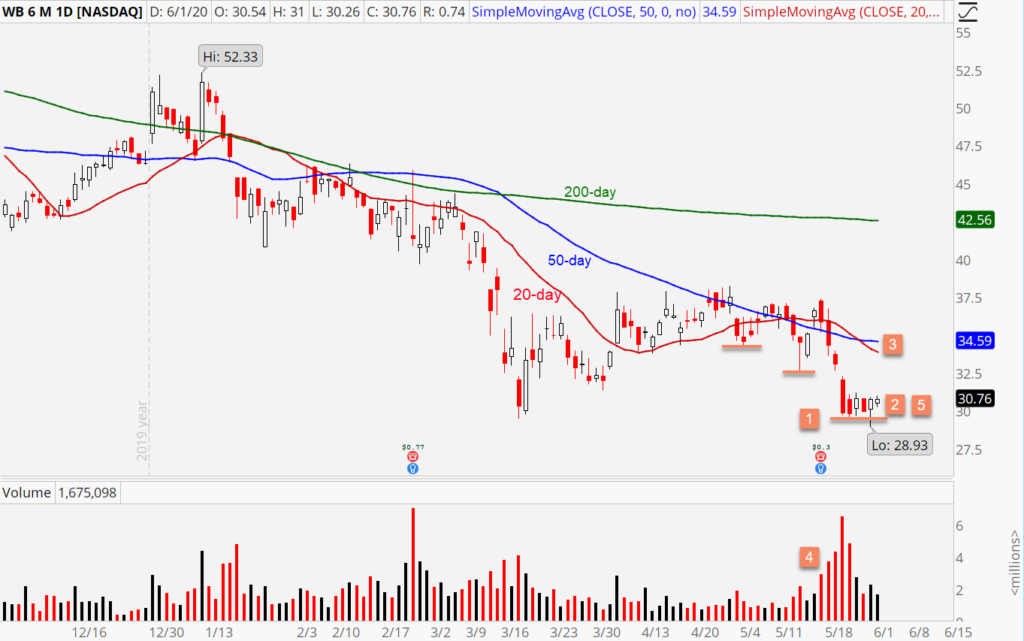
1. WB is stuck in a downtrend that saw increasing momentum on its last downswing.
2. After finding support near $30, WB has been consolidating for five bars.
3. WB is submerged beneath falling 200-day, 50-day, and 20-day moving averages. That confirms sellers are in control of the trend across all time frames.
4. High volume accompanied the last drop, suggesting heavy distribution by institutions.
5. A few bullish candles cropped up during the consolidation, including a hammer. This suggests buyers are putting up a fight at support. We’ll want to wait for the floor to give out before shorting.
Together, these five signals reveal a low-base breakout pattern. Bears might look to short the stock below $29.

 JOE NOTARANTONIO
June 13, 2020 at 11:03 PMThanks for the great lesson Tyler! You definitely get an exclamation point! Spot on.
 Rob Sweet
June 29, 2020 at 3:32 AMLove this…